DIY Large Wall Art + verses for the bedroom
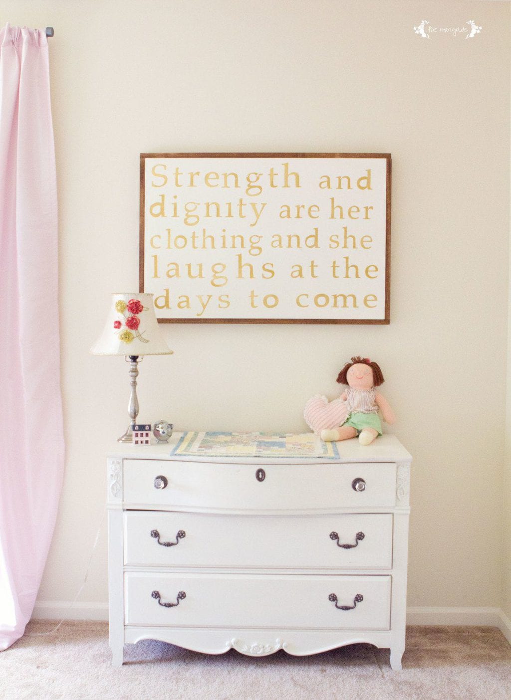
When we moved into our new home, we dedicated it with bible verses for each room of the house. I’ve been dreaming of this Proverbs 31 canvas wall art for Eve’s bedroom for some time now, but when I recently realized I already had the materials, I got moving.
I had a thrift store canvas that I’d previously tried (and failed) to artistically repurpose, so I painted it using a paint sample I already had on hand. Besides the price, the best part of repurposing a canvas is that you get fabulous texture under your new creation.
I used my Silhouette SD to cut the verse onto clear contact paper. I make so many mistakes that I’ve found this to be a cost saving way to use the Silhouette. I used a slightly imperfect font that would give me grace should the painting not go as I hoped.

After spending way too long placing the many pieces of contact paper on the canvas and lining it up just so, I spray painted it with my favorite Rust-Oleum metallic gold spray paint.
I was worried it would get under the contact paper. but as long as I made sure the paper was adhering around the letters I had absolutely no trouble.
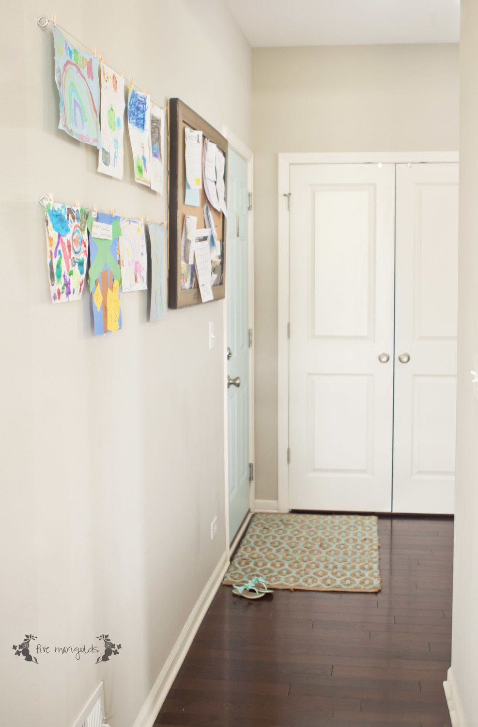
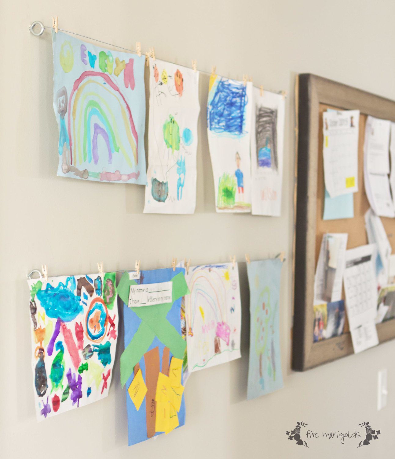
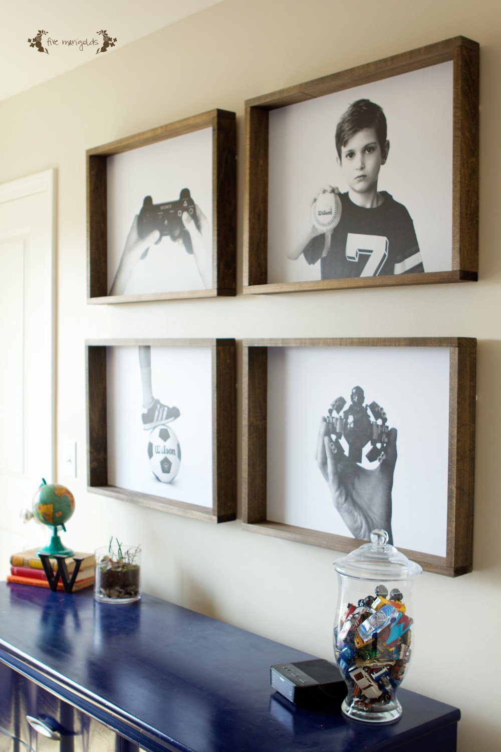
To build the frame, I used a similar technique as with Dub’s big kid room wall gallery, but I used wood that wasn’t quite as deep, since I wanted this particular frame flush with the art.
I used Minwax stain in Early American, which is lighter IRL and gives it the right amount of color and rustic vibe.

I debated (and am still debating) taking a tiny bit of wood stain on a rag and dry rubbing the canvas for a subtle shabby chic look.
I’ve also considered dry rubbing a tiny bit of the white paint over the frame very lightly for the same reason. But, at this point I’m afraid to ruin it!

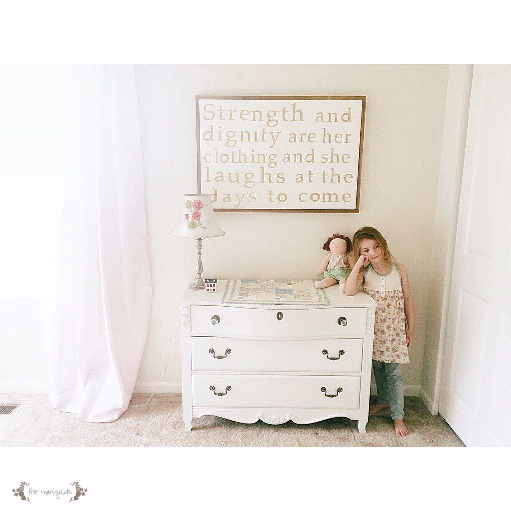
I’m so happy with how this Proverbs 31 canvas wall art turned out. I love the contrast of metallic gold and ivory against the rustic frame, and the sweet reminder my little girl will wake up to each day.
I’m already dreaming of how I might create a variation for Belle’s room 🙂
Additional bible verses that would be great for the girls’ bedrooms include:
God is with her; she will not fail. Psalm 46:5
He fills my life with good things. Psalm 103:5
I am fearfully and wonderfully made. Psalm 134:14
He calls me beautiful one. Song of Solomon 2:10
She is far more precious than jewels. Proverbs 31:10

Details:
- Lamp – Anthropologie (old)
- Curtains – Simply Shabby Chic
- Quilt – Handmade by grandma 🙂
- Paint color – Behr Seed Pearl
Interested in more upcycled DIY Wall art? Check out my other projects here:

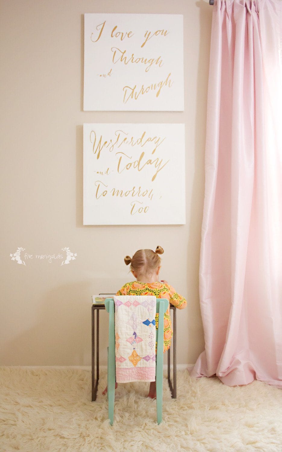
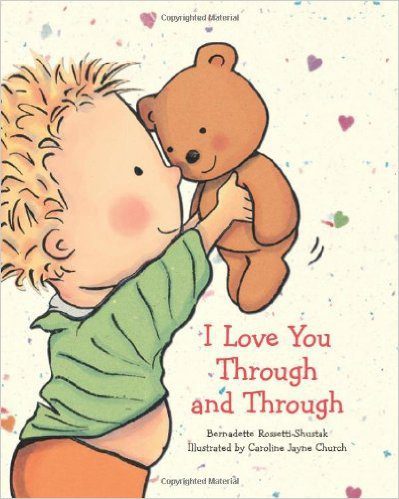
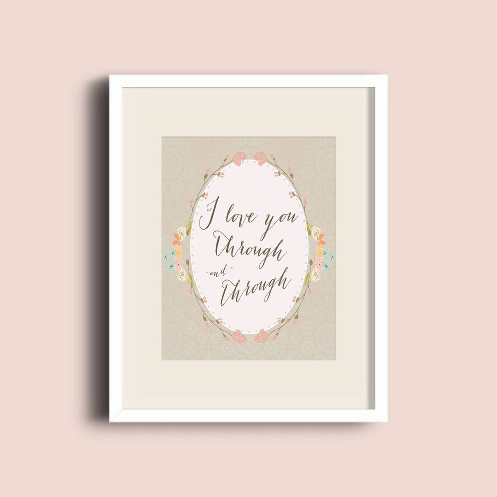
I Love You Through & Through Paired Canvases

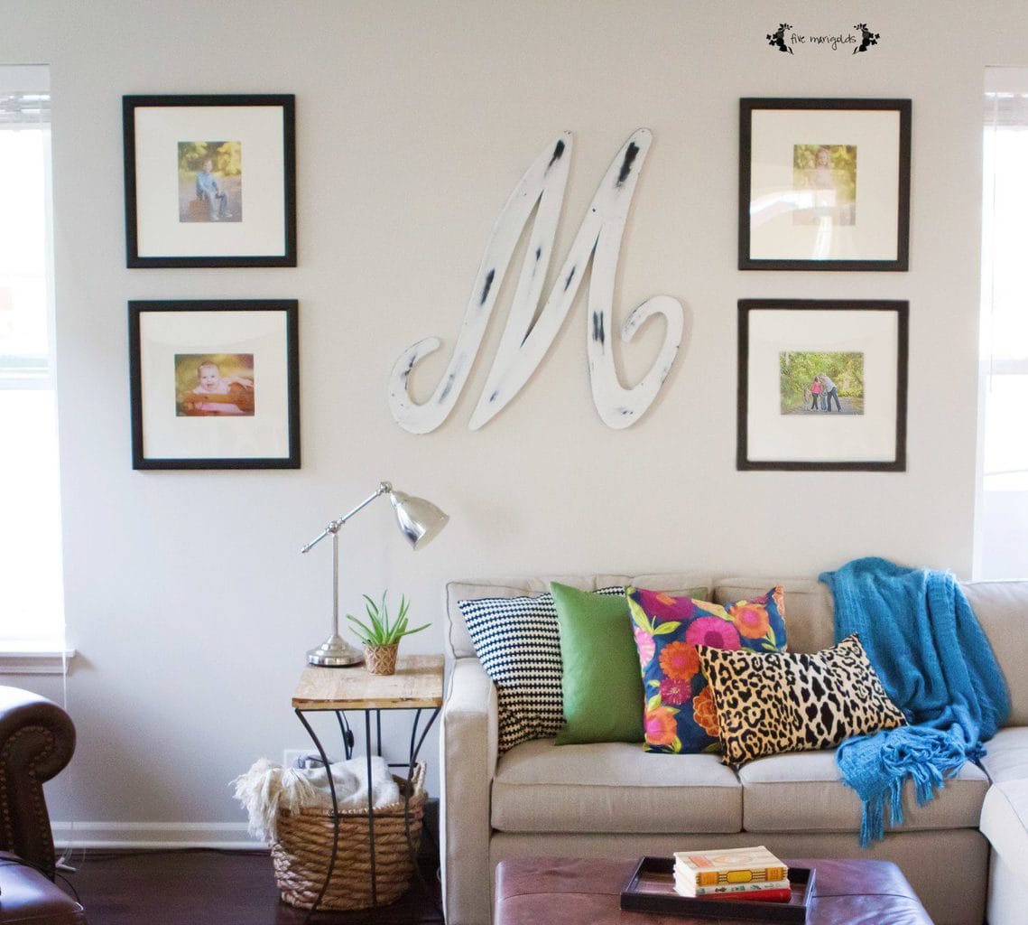
Framed Engineer Prints Wall Gallery

Monogrammed Pallet Art

DIY Chalkboard using Garage Sale Frame